Burnup and burndown charts are visual tools for displaying completed work and work remaining in the Product Backlog.
Some teams use both. In my opinion, this is unnecessary, as the burndown chart is less flexible and can be fully replaced by the burnup. Let’s see why.
A typical burndown looks like this:

For the same velocity, a burnup would look like this:
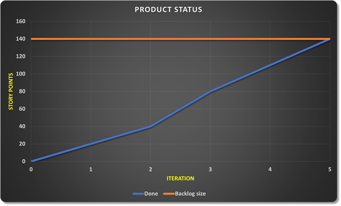
To estimate the amount of remaining work, we had to add a line representing the backlog size to the burnup. In the burndown, the x-axis serves this purpose.
The amount of work in the product backlog rarely remains the same across iterations. How do we show such a change in scope on the chart?
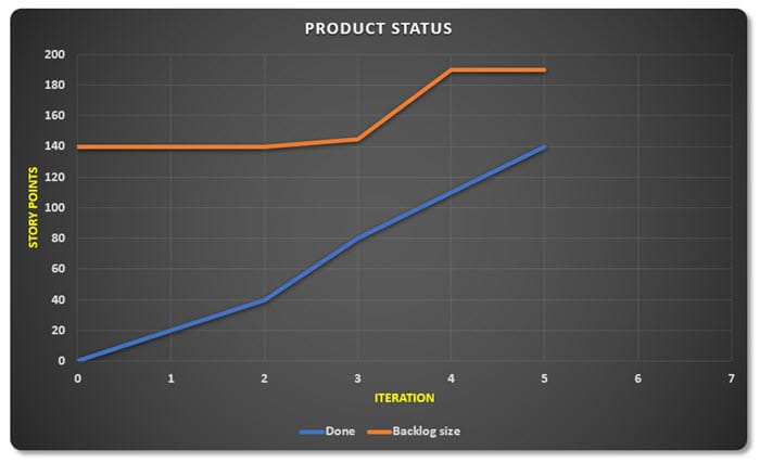
On a burnup chart, this is simple. We adjust the backlog line:
On a burndown chart, however, showing additional scope is a bit more difficult. Some teams subtract the added scope from the work already done (image). Such a representation is quite bad for team morale. Members quickly get the feeling that they’re regressing despite all their efforts.
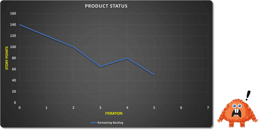
Another way to visualize additional scope on a burndown chart is to move the scope line into the negative. This is usually shown in one of the following ways (line or columns).


None of the above methods of adjusting the burndown chart are practical. The burnup chart, due to its design, avoids these problems. An additional bonus is that we can develop the burnup into a Cumulative Flow Diagram (CFD) without any special complications, which we looked at in more detail in this article.

CFD diagrams are a useful Lean tool that provide developers and the Scrum Master with insight into the flow of functionality through the development process.
Scenarios and Forecasting
The burnup chart can also be used to predict project duration with different scenarios. Based on the team’s velocity, we can draw projections that show possible development scenarios:
Realistic forecast is based on the average speed from past iterations and is equivalent to the linear trend of velocity from previous iterations,
Optimistic forecast assumes that the team will work faster in the next period (factor 1.15 on the chart),
Pessimistic forecast shows what happens if progress is slower (factor 0.85 on the chart).
In the chart below, we are at the beginning of the 6th iteration and want to prepare projections based on positive or negative factors we anticipate in the future.

This way, we don’t get one “exact” completion date, but a range of possible dates. This is much more useful for the Product Owner and stakeholders, as they can realistically assess risks and make decisions based on multiple scenarios.
Factors that can influence the value of the modifier for optimistic or pessimistic variants could include, for example:
- planned vacations and training
- anticipated sick leaves (based on past trends) during virus seasons
- completion of onboarding new team members and their full engagement in the project
- arrival of new team members
- planned start of using TDD
- splitting the team into two smaller ones working on the same product
- hiring a Scrum Master
- planned work optimizations identified in the Sprint Retrospective
- etc.

Conclusion
The burnup chart is not just an alternative display of the burndown, but it brings some important advantages. The biggest is that it clearly separates team speed from scope changes. If the scope increases, we see this as a shift in the upper line, and if the team works slower, this is shown by the slope of the lower line. Additionally, the burnup allows for easy communication with stakeholders, as it’s immediately clear how much work has been done and how the goal is changing. Such a display is often psychologically more encouraging, as we see progress as growth and achieved goals, rather than counting down remaining work.